A friend recently asked me about my process of trying to figure out artwork and overall presentation that goes along with the album. So, if you are interested, I thought I would talk a little bit about this.
Visual presentation is incredibly important to me. I really love this process, and it can often be just as difficult and time consuming as making the actual music. We spent a year recording this album (off and on) and throughout this time I was trying to dig deep and keep my eyes open for anything that would set off an inspiration alarm. I knew I wanted to come up with an outfit for the guys that would look sharp and match the music, as well as potentially have my sister make me an outfit of some kind. What any of those things looked like, I couldn’t tell you. I was pretty certain I didn’t want anything for myself that was form fitting or low-cut. I wanted something either genderless or … shaped weirdly. I couldn’t figure it out. My general philosophy is - I’ll know it when I see it.
But what if that takes forever??? …. It was.
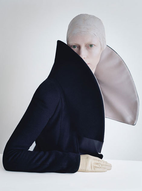
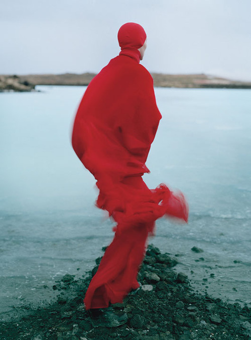
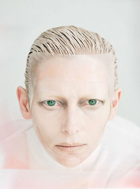
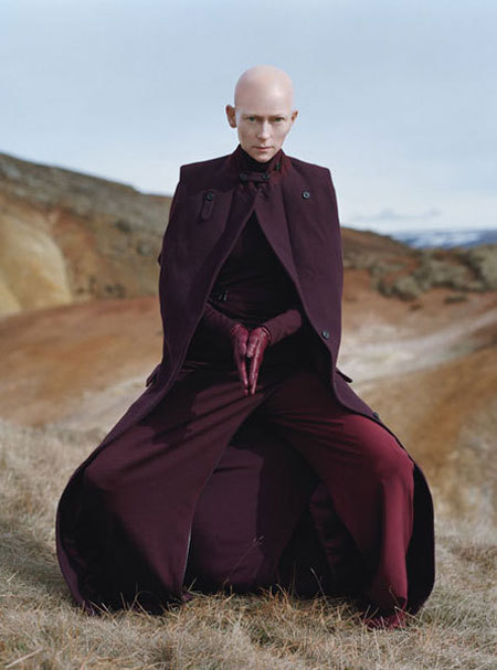
I had to force my hand a bit. I knew that when I thought about visuals and listened to the first song we mixed for the record, “Arcadia” (the album’s title also comes from a lyric from the song, “As you sit there wondering how this flesh could belie the mind, sharp as knives, Free As Thieves, We are all young in Arcadia”), I kept thinking about this spread in W magazine that Tilda Swinton did a few years ago that I had adored and had been obsessed with. The shoot was space-aged, but natural. The lines of her clothing were minimalist, but bold. There were these bright cherry reds and whites that popped against bleak backgrounds and made everything look alive and out-of-this-world. And Tilda is just generally out-of-this-world. Well, I thought, why not go with this? Why not use these images as an inspiration and see where this leads me? And so I did. I finally had a starting point. Unfortunately, I didn’t have a fabulous budget to go with it, so I had to try and figure out what was possible with what I had.
Here are some pictures from the W spread. You should check out the whole Tim Walker shoot though: http://www.wmagazine.com/people/celebrities/2010/08/tilda-swinton-tim-walker-cover-story-ss/photos/slide/1
